How to Make Your Donation Work Better on Mobile
Mobile donation page performance now plays a critical role in nonprofit fundraising success. Most donors today discover nonprofits through digital channels such as email campaigns, social media posts, and online fundraising events. In many cases, the first interaction happens on a smartphone. If the donation process feels slow, confusing, or difficult to complete, many donors leave before finishing their gift.
Many nonprofit teams believe their donation page works well because it looks organized on a desktop computer. However, mobile behavior is very different from desktop behavior. Small screens, touch navigation, and shorter attention spans create challenges that desktop testing does not reveal. A donation page that appears simple on a large screen may feel overwhelming on a phone if it requires too much typing or scrolling.
This is why improving your mobile donation page should be considered a fundraising improvement rather than just a design update. Every extra field, every delay in loading, and every confusing instruction can create friction. Over time, these small problems can result in significant lost donations.
The good news is that most improvements do not require a complete redesign. Small adjustments such as improving spacing, reducing required information, supporting autofill, and testing the experience on real devices can significantly improve completion rates. When nonprofits focus on making giving easier, they often see immediate improvements in donor satisfaction and fundraising results.
Why Mobile Donation Page Performance Matters for Modern Fundraising

Mobile giving continues to grow because donors expect convenience. A mobile donation page must allow donors to act quickly when they feel motivated to support a cause. If the process takes too long or feels complicated, donors may delay their decision and never return.
Mobile donors often give during short periods of attention time. They may be responding to an appeal during a break or after seeing a campaign message. This means the giving process must be designed to work smoothly within a limited time frame. Simplicity becomes essential because donors are less patient on mobile devices.
A strong nonprofit mobile giving experience focuses on removing effort from the process. Donors should immediately understand where to click, what information is required, and how long the process will take. When expectations are clear, donors feel confident moving forward. When expectations are unclear, hesitation increases.
Organizations that improve mobile usability often see better fundraising outcomes because they remove hidden barriers that prevent donors from completing their gifts.
Why Desktop Donation Pages Often Fail on Mobile Devices
Many donation pages are originally designed with desktop users in mind. When those same pages are viewed on mobile devices, usability problems often appear. Text may appear too small. Buttons may feel difficult to tap. Forms may require too much scrolling. Each of these issues increases the chance that donors abandon the process.
A mobile-friendly donation form must be designed specifically for touch interaction. This means making sure buttons are easy to tap, fields are spaced properly, and instructions are easy to read without zooming. When forms are simply reduced to fit a smaller screen instead of being designed for mobile use, usability suffers.
Testing only on desktop hides these problems. Real improvements happen when teams review the donation process on actual mobile devices and experience it from a donor perspective.
How Mobile Friction Translates Into Lost Donations
Friction refers to anything that slows the donor down or makes the process feel difficult. On a mobile donation page, friction can come from slow loading time, unnecessary questions, confusing navigation, or difficult payment entry.
Even small delays can reduce completion rates. If a donor must wait too long or repeat steps, they may lose interest. Over time, this can significantly affect fundraising performance.
Treating mobile optimization as a revenue issue helps nonprofits prioritize improvements. When the giving process becomes easier, more donors complete their gifts. Small usability improvements often lead to measurable financial impact.
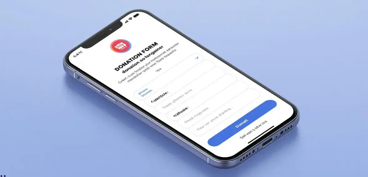
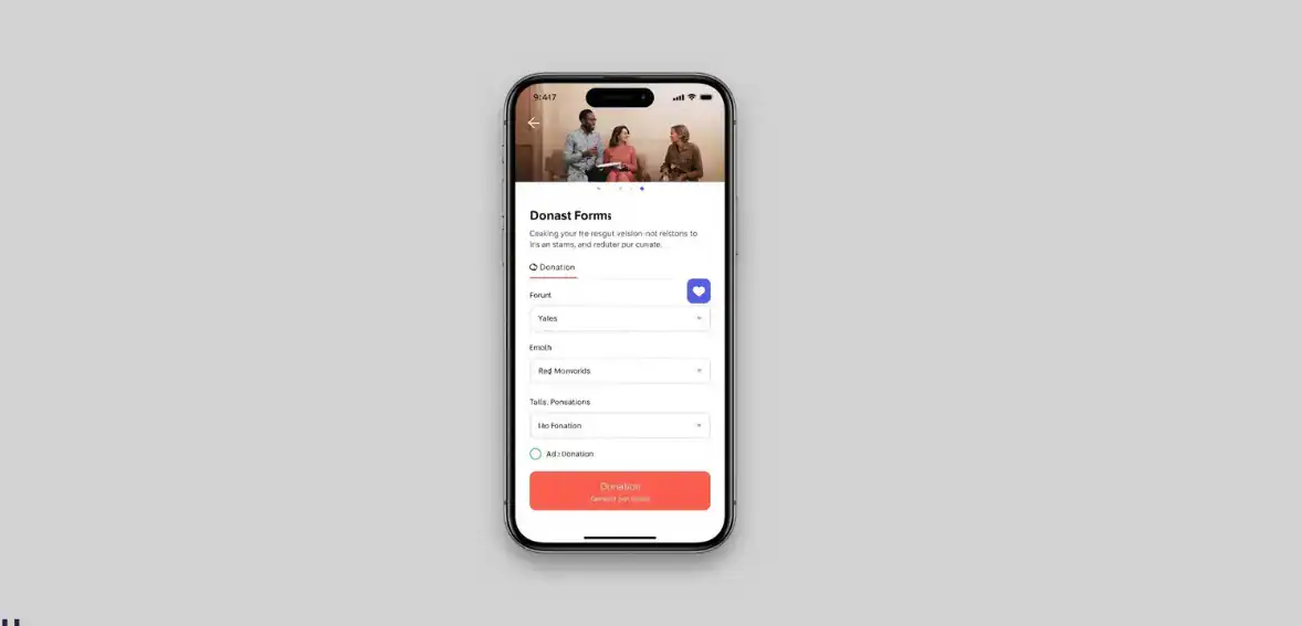
How to Structure a Mobile Donation Page for Better Conversions
The structure of a donation form plays a major role in whether donors complete the process. A well-structured time.-structured form feels predictable and manageable. Donors should feel they can complete the process quickly without confusion.
A good structure begins with basic information such as name and email. This should be followed by the donation amount selection, payment details, and confirmation. This order matches donor expectations and creates a logical flow.
Following proven mobile donation form best practices helps nonprofits reduce abandonment rates. Simplifying forms and focusing on essential information often improves completion without requiring technical complexity.
The Importance of Input Types and Autofill Support
Mobile devices offer features that make typing easier. When forms use correct input types, donors can complete fields faster. Email fields should trigger email keyboards. Numeric fields should open number pads. These details reduce effort and improve accuracy.
Autofill support is another important improvement. Many phones allow users to automatically fill in structured information in saved contacts and payment information. When forms support autofill, donors can complete the process much faster.
These improvements may seem small, but they significantly improve the experience of a smartphone donation page because they reduce effort and prevent typing frustration.
Reducing Form Length Without Losing Important Data
Many nonprofits ask for more information than is necessary during donations. While collecting donor data is important, requiring too much information can reduce completion rates.
Organizations should evaluate whether each field is truly necessary. If information is not required for receipts or communication, it may be better collected later rather than during the donation process.
Reducing required fields creates a smoother, more responsive donation page experience and helps donors complete their gifts more easily. Shorter forms almost always perform better on mobile devices because they require less effort.
How Digital Wallets Improve Mobile Donation Completion Rates

Payment friction remains one of the biggest barriers in mobile giving. Entering card details manually can feel time-consuming and increase the chance of mistakes.
Digital wallets help solve this problem. Payment options such as Apple Pay and Google Pay allow donors to complete transactions using stored information. This reduces typing and speeds up completion.
Adding wallet support can dramatically improve a mobile donation page because it removes the most difficult part of the process. Donors appreciate familiar payment systems because they already trust them.
When payment becomes easier, more donors complete the process instead of abandoning it during checkout.
Accessibility Improvements That Help More Donors Complete Donations
Accessibility improvements help create an accessible mobile checkout that works for every donor. While accessibility is often discussed in terms of compliance, it also improves usability and conversion.
Clear labels help donors understand what information is required. Forms should never rely only on placeholder text. Labels should remain visible even after typing begins.
Readable text also improves usability. Fonts should be large enough for comfortable reading, and colors should provide a strong contrast. Mobile donors may be reading in different environments where visibility matters.
Accessibility improvements make the donation process easier for everyone. When forms are easier to understand, more donors complete their gifts.
How Error Messages Affect Donor Confidence
Error handling is a key part of strong mobile fundraising UX because it affects donor confidence. When donors make mistakes, the system should help them recover quickly.
Good error handling clearly explains what needs to be corrected. It highlights the exact field and preserves the entered data. This helps donors fix mistakes quickly.
Poor error handling often forces donors to reenter information or guess what went wrong. When frustration increases, donors often leave instead of retrying.
Improving error handling can significantly improve completion rates because it supports donors when small mistakes happen.
How to Test Your Mobile Donation Page Before Campaign Launch
Testing is one of the simplest ways to improve a mobile donation page. Nonprofits should test their donation process on real devices before launching campaigns. This helps identify usability issues before donors encounter them.
Teams should move through the donation process step by step. They should evaluate readability, typing effort, payment behavior, and confirmation experience. Testing should focus on how easy the process feels rather than just whether it works.
Regular testing supports effective nonprofit website mobile optimization because it focuses on the real donor experience rather than assumptions.
Why Testing Payment Confirmation Matters
Testing should include the entire donor journey. After completing a donation, donors should see a confirmation message and receive a receipt. These steps help build trust and reassure donors that their gift was successful.
Confirmation pages should display properly on mobile screens. Emails should arrive quickly and contain clear information. These details strengthen donor confidence and improve long-term relationships.
Testing Speed Under Real Mobile Conditions
Testing should also include performance checks using mobile networks. Many donors give using cellular connections. A mobile donation page that loads quickly under real conditions helps prevent abandonment.
Organizations should review loading time and identify anything slowing the experience. Removing unnecessary scripts and optimizing images can significantly improve performance.
Speed testing should become a routine part of fundraising preparation.
What Metrics to Watch After Improving Mobile UX
Measuring results helps nonprofits understand whether improvements to their mobile donation page are working. Mobile conversion rate is one of the most important metrics because it shows how many visitors complete donations.
Form completion rate helps identify where donors leave the process. If many donors abandon the same step, improvements may be needed there.
Tracking average donation value also provides insight. When donors feel confident in the experience, they may give more.
Monitoring these metrics helps nonprofits continue improving their mobile experience instead of treating it as a fixed tool.
Connecting UX Improvements to Fundraising Growth
User experience improvements should always connect to fundraising performance. Tracking mobile revenue growth helps organizations understand the financial impact of usability improvements.
When nonprofits see that mobile improvements increase completed gifts, it becomes clear that UX is not just design. It is part of a fundraising strategy.
Organizations that continuously improve their mobile giving experience often see stronger long-term fundraising performance.
Conclusion
A strong mobile donation page is now essential because mobile devices have become the primary way many donors interact with nonprofits. When the giving process feels difficult, donations are often lost before completion, even when donor intent is strong.
The encouraging reality is that most improvements are simple. Simplifying forms, improving payment options, improving accessibility, and testing regularly can significantly improve results. Nonprofits that treat mobile optimization as part of their fundraising strategy often see better donor experiences, higher completion rates, and stronger long-term fundraising growth.
FAQs
Why do mobile donation pages usually convert worse?
Mobile donation pages often convert worse because they are not designed for small screens and require too much typing. Simplifying forms and improving speed usually increases completion rates.
What is the biggest mobile UX mistake on donation pages?
The biggest mistake is asking for too much information during the donation process. Long forms create friction and increase the chance that donors abandon the process.
Should we use one-page or multi-step mobile forms?
Short forms usually perform better on one page because they feel faster. Longer forms often work better when divided into simple steps.
How do we test a donation form on different phones?
Teams can test on real devices and use browser testing tools to review layout behavior across different screen sizes.
Does accessibility also improve conversion?
Accessibility improvements often improve conversion because they make forms easier to understand. Clear labels and readable text help donors complete their gifts successfully.