
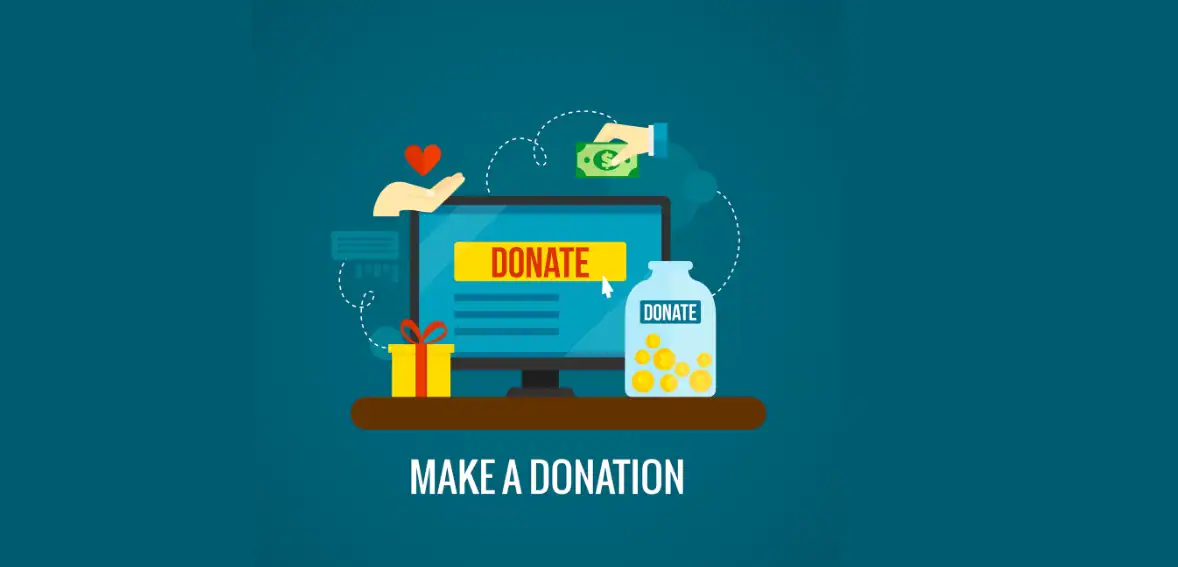
What to Put on a Donation Landing Page So More Visitors Give
A donation landing page is essential for every nonprofit organization because it provides vital support that enables them to maintain ongoing financial stability. The majority of organizations dedicate their resources to running outreach programs and campaign activities, yet they fail to recognize how their donation page results show their actual fundraising success. High visitor numbers and sustained interest create multiple opportunities that organizations fail to capitalize on because they lack proper systems. The donation landing page will achieve better results when its design meets your business requirements, and you continue your marketing efforts at their current level.
People who come to a donation landing page already show intent to donate. The system experiences problems because users encounter difficulties interacting with it due to unacceptable site conditions that prevent them from performing their tasks. The organization needs to determine which elements will build successful donation page experiences through its donation page design process. The complete donation process requires users to complete every step, from the first headline to the final call-to-action button.
Design elements alone do not create a successful nonprofit landing page that generates high conversion rates. The system requires engaging nonprofit donation page content, straightforward donation page communication, and seamless user interaction. When organizations create content that aligns with what donors want to receive, they build emotional ties with their visitors, which helps them trust their desired donations.
The guide presents a comprehensive list of essential components for a donation landing page. The document describes how to build a system that establishes trust through multiple elements while developing efficient strategies for enhancing website performance. These insights will help you convert more visitors into donors effectively, whether you are creating a new nonprofit donation landing page or enhancing your existing one.
Why a Dedicated Donation Landing Page Drives Higher Conversions
The purpose of a donation landing page is to convert web visitors into donors. A donation landing page is not part of a general website or general web pages with multiple options, but is an individual page with only one goal (ie, converting visitors into donors) with no distractions. Therefore, the website visitor can focus on making an individual contribution.
A common mistake made by non-profit organizations is embedding donation options on general web pages rather than using dedicated Landing Pages. Visitors often become confused, lose interest and motivation, and don’t take action when presented with too many options on general donation web pages.
A dedicated donation landing page provides the non-profit organization with an opportunity to create very specific content, i.e., content uniquely suited to a specific campaign, target audience, or cause. The specificity of the content enhances relevance and connection with the visitor’s emotions.
Simplicity also plays a significant role from the User Experience perspective, because the visitor should understand within seconds of visiting the Landing Page that they are on a donation page. Having a clearly defined structure and an intuitive design reduces friction and increases completion rates.
By creating dedicated donation landing pages and leveraging their resources to enhance the user experience on those pages, non-profit organizations can deliver a user journey that maximizes donor conversions and supports long-term fundraising goals.
Crafting a Clear and Compelling Headline That Converts
The headline serves as the initial content visitors encounter upon arriving at a donation landing page. The main content of the page begins here because the headline establishes the path visitors will take. A powerful headline instantly conveys the content’s main message.
The donation page uses its messaging to show how donations create tangible results for people who benefit from its support, rather than providing details about the organization. The impact that donors create through their financial support is not a common statement. The method establishes an instant connection that aligns with the donor’s motivation.
Clarity is essential. Visitors should understand the cause and why it matters within seconds. Visitors should use simple language to explain their needs in direct statements. The use of straightforward language leads to better understanding between people.
People establish emotional connections through their feelings about the situation. A headline needs to create two emotional responses, which include empathy and urgent action, yet it must maintain an appropriate level of emotional intensity. Users who explore the content at their own pace will find this method effective.
Subheadlines provide supporting information that helps deliver the main message. The materials that support this cause help users understand which actions they need to take to donate. The elements work together to create a nonprofit landing page that achieves high conversion rates.
The first impression created by your headline, which delivers both clear information and powerful content, will increase the time users spend interacting with your website.
Writing Nonprofit Giving Page Copy That Builds Trust
A nonprofit giving page should both establish the organization’s credibility and inspire supporters to take action. Supporters of these causes need to feel confident that their donations will be used efficiently and effectively when offered. Even the strongest of causes may never have the opportunity to convert because there isn’t an element of trust.
Transparency is one of the fundamental building blocks of trust. Be specific about how donations are used and the positive impact they have on the community. Providing specific examples helps supporters feel connected to the cause by showing how their donation will be useful. Avoid making vague claims that have no supporting evidence or data.
Tone in writing is important. While the writing should maintain a professional tone, it should also be very approachable. Using excessive technical language creates a disconnect, while too much emotion can give the impression of manipulation. A balance in writing creates an authentic experience.
Storytelling is critical to creating engagement. Donors want to feel a personal connection to the cause they are supporting. Sharing actual examples of how your organization’s mission or cause has had a positive impact on the community creates a more fulfilling donation experience.
It’s imperative to have consistency throughout the giving page. Every piece of content on the nonprofit’s giving page should align with the organization’s mission and messaging. This will provide donors with an additional level of agency and build the trust necessary for the conversion process.
By focusing on transparency and authenticity, a nonprofit can maximize the potential of converting web visitors to a donation through the use of proper ‘giving page’ content.
Structuring Donation Page Content for Maximum Clarity
The design of a donation landing page determines how users will interact with the website. The donation process is easier to follow when the website uses an organized layout that guides visitors through it. The website becomes difficult to navigate because its unorganized elements create obstacles that reduce conversion rates.
The website needs a logical structure. The page should move from awareness to action seamlessly. The structure requires a clear headline, supporting details, and a powerful call to action. The user progression needs to start from their current stage and move toward their next goal.
Using short paragraphs with distinct sections helps readers better understand the text. Visitors often scan content rather than reading every word. The system provides organized information that enables users to find vital information with ease.
The system’s primary task is to identify essential elements. The website needs to display its donation forms and call-to-action buttons clearly. The website needs to display these elements in an accessible way without making them hard to find.
Whitespace also plays a role in clarity. Users can reduce their cognitive load by using a clean design, which helps them concentrate on vital details. When visitors encounter too many elements on a page, they do not want to take any action.
Nonprofits create effective user experiences that lead to increased conversions through properly organized donation page content.
Creating Strong Nonprofit Call to Action Elements
The most important element of a donation landing page is its nonprofit call to action, which leads users through the donation process by meeting three essential requirements: clear presentation and compelling content, and visible placement.
Effective calls to action use action-oriented language. The terms “Donate Now” and “Support This Cause” serve as instructions for users. Users will become confused when they encounter vague language that lacks specific meaning.
The right placement creates equal value with other elements. Multiple instances of call-to-action buttons must be distributed throughout the entire webpage. This design choice enables users to access content at any point throughout their browsing experience.
The design elements of a website determine how well it achieves its goal. The buttons need to visually attract attention while maintaining design consistency with the rest of the website. The use of contrasting colors, along with clear typography, enhances content visibility.
The use of urgency increases conversion rates. Time-sensitive language creates a sense of urgency, which drives users to make quick decisions about their actions. The method should be used cautiously because it can create a deceptive appearance.
Nonprofit organizations can enhance their donation landing page performance by optimizing their call-to-action elements.
Highlighting Impact to Strengthen Donation Page Messaging

Donor motivation is driven by an impactful messaging strategy. Visitors want to see how their donations make an impact. Donor engagement and trust are enhanced by using specific, clear impact messaging. Quantifying that impact can be even more impactful than using only text or statistics. For instance, when explaining what a specific donation amount will do, the visitor will have a clear understanding of the tangible benefit that will result from their donation.
When aligning donor values with the impact of their gift, it’s essential to ensure your messaging reflects your target audience’s motivations to create a stronger emotional appeal and inspire action.
Another principle of effective impact messaging is consistency. As much as possible, use impact messaging throughout the donor’s journey to keep them focused on the reason for making a gift.
Avoid complex wording or explanations in your messaging about impact; simple language is more powerful for communicating impact to the reader. This will help readers connect quickly and easily with your organization.
Reducing Friction in the Donation Process
The primary obstacle to completing donations through donation landing pages is friction. Any degree of friction, large or small, will reduce the likelihood that users will complete a donation. Therefore, if you want to improve donation completion rates via donation landing pages, you need to reduce as much friction as possible.
One way you can reduce friction is to make the donation form much shorter and ONLY ask for the information you need from the donor, so completing their donation is a priority. The longer the donation form, the less likely people are to complete the donation.
Additionally, you should offer several payment options for donors. By doing this, you give donors a variety of payment methods to make their donations. This allows for greater accessibility and flexibility for those who wish to support your cause with a donation.
Clearly explaining how donors can complete each step of the donation process eliminates confusion and potential stressors that could lead to hesitation and/or abandonment.
Mobile optimization is also very important. Many people use their phones to visit donation pages, and providing mobile users with a seamless experience can increase donation accessibility and completion rates through donation landing pages.
Using Social Proof to Build Credibility
Social proof is an effective method for establishing trust between visitors and a donation landing page. Social proof shows that others support the cause and establishes the organization as trustworthy.
Testimonials function as social proof because they provide evidence to support their claims. Authenticity comes from sharing donor experiences and beneficiary stories. These narratives help build emotional connections and reinforce trust.
Displaying donation totals or supporter counts fosters a sense of community. This behavior motivates users to participate in supporting the cause together with others.
Partnerships and endorsements also enhance credibility. Trust increases when organizations establish connections with trustworthy partners. This is particularly important for new or lesser-known nonprofits.
Social proof receives reinforcement through transparent reporting of actual results. The organization shows its commitment to responsibility through sharing its results and achievements. This builds confidence in the organization’s impact.
Optimizing for Mobile and User Experience

Nonprofit organizations need to optimize their websites for mobile users, as this is vital to creating landing pages that achieve high conversion rates. A significant portion of users access donation pages via mobile devices. Organizations lose potential donors because their websites provide insufficient mobile user experience.
The page will automatically adjust its layout via responsive design to accommodate various screen dimensions. This design solution enhances both user experience and accessibility options. Users should be able to interact with buttons and forms and read text content on smaller display devices.
Website loading speed is one of its most important factors. Users experience frustration when loading times are slow, leading to higher bounce rates. The performance optimization process results in an uninterrupted user experience.
Website navigation needs to provide users with a straightforward way to navigate the site. Users should be able to complete the donation process without confusion. The system design establishes clear layout patterns that require users to perform minimal actions.
Testing represents an essential process. The team needs to assess page performance across various devices to detect issues. The system will achieve maximum efficiency through its process of ongoing performance enhancement.
Nonprofit organizations can expand their audience reach through mobile optimization while increasing donor conversion rates.
Incorporating Suggested Donation Amounts Effectively
Suggested donation amounts help users decide, as many visitors are unsure how much to give. By offering choices, you eliminate their uncertainty.
Good donation pages (with suggested amounts that include descriptions of what each can do) can help users make choices with confidence, thereby increasing engagement with the donation site.
Providing users with an option to use a custom amount is also a way to ensure donors have a choice and to include everyone — some donors may have financial limitations, and some don’t.
If you provide suggested amounts for users to consider but want to use them to encourage donors to give higher amounts, do so in a way that suggests the amount without pressuring donors to give more than they can afford.
Another way for nonprofits to help their donors give more is by offering recurring donation options as part of an ongoing support plan, along with details on the potential ongoing benefits for both the donor and the nonprofit. This type of page helps increase the nonprofit’s long-term revenue per donor.
Ensuring Transparency and Security on Donation Pages
The donation landing page needs both transparency and security functions to establish trust with donors. Donors need assurance that their information is safe and their contributions are used responsibly.
The organization needs to present clear documentation about its donation allocation process. The organization needs to provide detailed examples to increase transparency. This process helps donors make their choice with confidence.
The organization needs to display all security measures to users. Secure payment icons serve as indicators that reassure users. This solution reduces users’ concerns about data privacy and fraudulent activity.
The organization needs to provide users with access to its privacy policies. Users need to know the procedures for managing their personal information. The organization needs to establish direct communication to build trust and ensure regulatory compliance.
The organization provides confirmation messages to users after they make donations, which helps to build trust. The donor experience improves through acknowledgment of contributions combined with details about upcoming stages.
Nonprofit organizations can establish a trustworthy donation environment by prioritizing transparency and security measures.
Testing and Optimizing for a High-Converting Nonprofit Landing Page
Nonprofit organizations need to use ongoing optimization methods to maintain their effective landing pages. Even well-designed pages can benefit from ongoing improvements based on user behavior.
The most effective optimization method is A/B testing, which allows businesses to test multiple website elements through an experimental process. Testing different elements, such as headlines, call-to-action buttons, and layouts, helps testers discover the most effective combination. Data-driven decisions lead to performance enhancements.
Analytics systems track user activity to provide insights into user movements across digital platforms. The system needs to track both conversion rates and drop-off points, as these metrics indicate which aspects of the system require improvement. Targeted adjustments become possible through this process.
User feedback provides valuable insights that help organizations make better decisions. User experience research helps organizations discover existing user problems and their potential solutions.
The optimization process must continue without interruption. The page remains effective because regular updates keep it current with user needs.
Conclusion
To convert your website visitors’ intent into valuable financial donations, the donation landing page must be designed well. Ideally, the website should provide visitors with an optimal donation journey by creating an integrated donation process and providing visitors with a sense of trust throughout the donation process. Each of component on the page will work together to help establish visitor trust and provide a level of operational efficiency.
Optimizing the donation landing page is achieved by using distinct titles for separate elements of the non-profit organization’s call-to-action. Minimizing operational barriers and optimizing the donation landing page for mobile devices, users are able to access the donation landing page and complete donations at higher rates.
To continuously enhance the donation landing page, the team will perform testing and tracking using actual user engagement and donation statistics to improve the organization’s overall ability to build donation landing pages that generate a high rate of conversions.
The donation landing page should be viewed as a strategy-based resource rather than a static web page element. The guide offers best practices for building donation pages that will produce successful results regardless of the size of the organization.
FAQs
- What is a donation landing page?
The purpose of a donation landing page is to serve as a single website that converts site visitors into donors. The website operates with one main purpose through its straightforward content, which includes donation forms and donation request buttons.
- What should be included on a donate page?
A donation page needs to display a persuasive heading, an impact results description, multiple donation options, trust verification elements, and an effective donation request that directs visitors to complete their contribution.
- How can I improve nonprofit donation landing page conversions?
The donation process is improved through simplification, mobile user experience enhancements, clear message delivery, social proof display, and the presentation of recommended donation amounts.
- Why is donation page messaging important?
The donation page contains essential information that demonstrates how contributions make a difference while creating trust with potential donors. The organization needs to create clear and appealing messages that help users understand the cause and decide to donate.
- What makes a high-converting nonprofit landing page?
A nonprofit landing page that achieves high conversion rates must combine effective writing with an organized layout, a user-friendly design, and powerful donation request components.