
Donation Form Optimization: How to Maximize Online Giving Conversions
Nonprofit organizations invest significant time and money driving supporters to their websites, yet many lose donors at the most critical moment: the donation form. Donation form optimization is often overlooked, even though it directly determines whether interest turns into completed online donations. Research across the nonprofit sector consistently shows that a large percentage of donors abandon donation forms before finishing, usually because the process feels confusing, slow, or untrustworthy. For US-based nonprofits, where donors expect fast, secure, and mobile-friendly digital experiences, even minor friction points can quietly reduce revenue.
This focuses on practical ways to improve the donation experience and increase your conversion rate without chasing new traffic. By enhancing their online giving process and applying proven donation-page best practices, nonprofits can raise more funds from the same number of visitors. The donation page is where marketing, email campaigns, social media, and search efforts either succeed or fail, making optimization essential rather than optional.
Why Donation Form Design Directly Impacts Conversion Rate
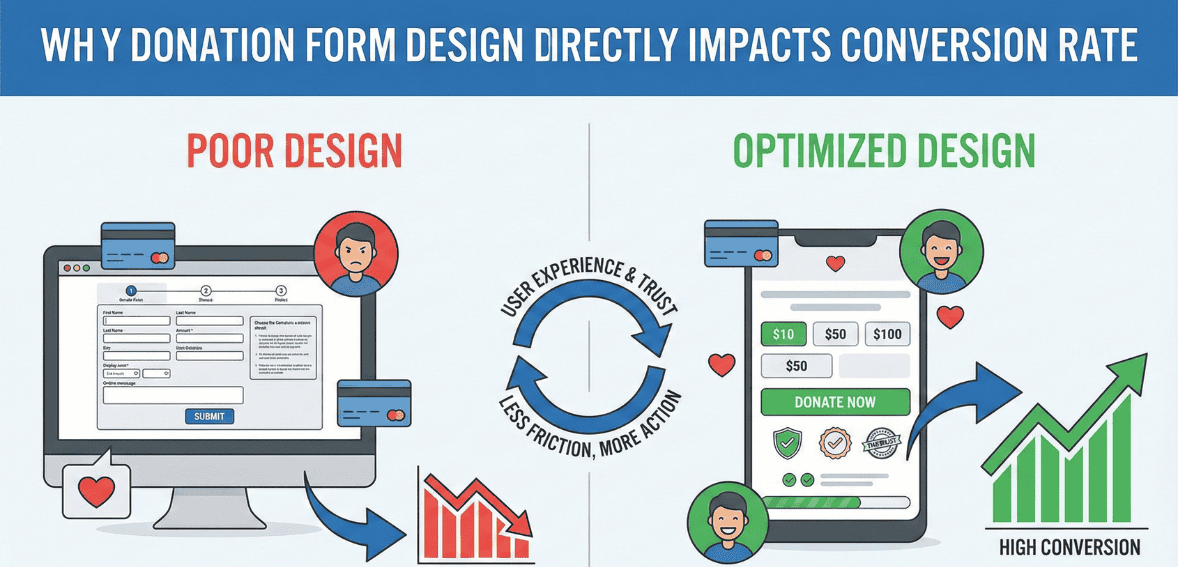
When a donor clicks the “Donate” button, they are signaling intent. At that moment, your organization has already earned attention and trust. However, if the checkout process feels overly complicated, asks unnecessary questions, or appears insecure, that intent quickly fades. Many donors abandon forms due to minor frustrations, such as being required to create an account, encountering too many required fields, or struggling with a mobile layout that is difficult to use.
For nonprofits in the United States, where donors regularly complete ecommerce transactions online, expectations are shaped by commercial checkout experiences. People are used to fast payments, clear instructions, and transparent security signals. If your donation form feels outdated or cumbersome, donors may question whether their gift will be processed correctly or whether their personal information is safe.
Improving your donation form does not require a complete website redesign. In many cases, simplifying language, removing unnecessary steps, and clarifying each field’s purpose can significantly increase completion rates. A modest improvement in conversion rate can translate into a meaningful increase in revenue over time, especially for organizations running recurring digital campaigns.
Streamlining Form Fields to Reduce Abandonment
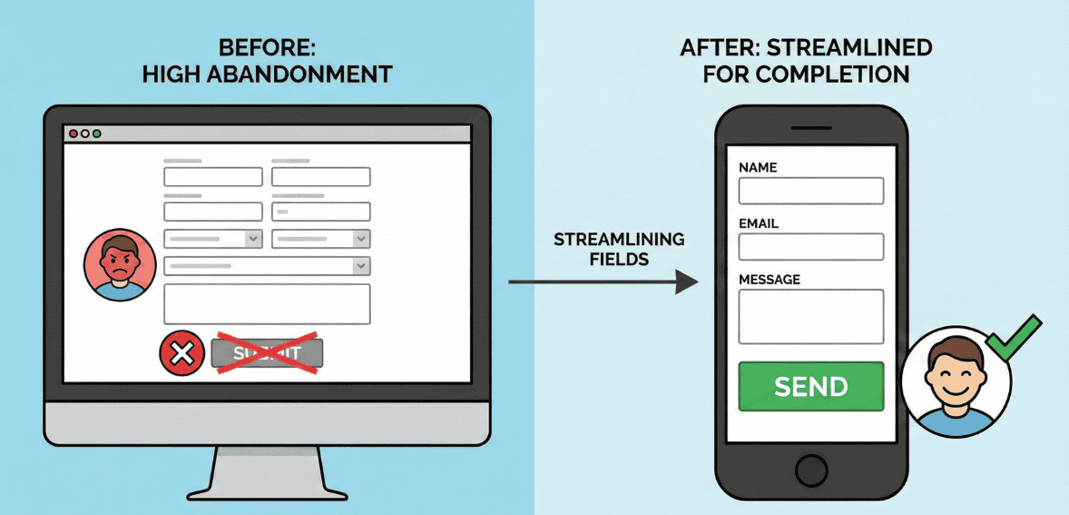
One of the most common barriers to successful online donations is an overly long form. Donors typically want to give quickly and move on. When a form requests information that feels unrelated to the donation process, it creates hesitation and fatigue. Every additional field increases the likelihood that a donor will abandon the process.
Effective donation form optimization starts by identifying the minimum information required to process a gift and send a receipt. For most US nonprofits, this includes the donor’s name, payment details, and email address. Mailing addresses may be necessary for tax acknowledgments, but optional demographic or marketing questions are best saved for follow-up communications.
Clarity is just as crucial as brevity. Each field should have a clear label written in plain language. Donors should immediately understand why the information is needed. For example, if an address is required for tax purposes, briefly stating that reason can reduce confusion. Allowing anonymous donations and not forcing name fields when anonymity is selected also respects donor preferences and removes unnecessary friction.
The overall goal is to make the donation process feel fast and respectful. A donor should feel confident that they can complete the form smoothly in under a minute without feeling interrogated or distracted.
Creating a Mobile-Friendly Donation Experience
Mobile devices now account for a significant share of nonprofit website traffic in the United States, yet mobile conversion rates often lag behind desktop conversion rates. This gap usually stems from donation forms that are not optimized for mobile users. Small text, cramped layouts, and excessive typing can frustrate donors trying to give on their phones.
A mobile-optimized donation form prioritizes simplicity. Fields should be easy to tap, with enough spacing to prevent errors. Single-column layouts perform better on small screens because they naturally guide the donor’s eye downward. Minimizing required typing by using autofill features, dropdowns, and numeric keyboards for payment fields helps reduce effort.
Speed also matters on mobile. Slow-loading donation pages increase abandonment, especially for users on cellular networks. Compressing images and avoiding unnecessary scripts can improve performance and keep donors engaged. Mobile-friendly payment options, such as digital wallets commonly used in the US, can further streamline the checkout process by allowing donors to complete gifts without manually entering card details.
Testing your donation form on multiple devices is essential. What looks fine on a desktop monitor may feel frustrating on a smartphone. Regular testing ensures that your online giving experience remains accessible and intuitive for donors wherever they are.
Also read: Donation Form Abandonment: Why 60% of Donors Start But Don’t Finish (And How to Fix It)
Building Trust Throughout the Checkout Process

Trust is central to successful donation page best practices. When donors give online, they are sharing sensitive financial and personal information. If the donation form does not clearly communicate security and legitimacy, donors may hesitate, even if they strongly support the mission.
Visible security indicators help reassure donors that their information is protected. Simple cues, such as a lock icon or a brief statement explaining that the form is encrypted and compliant with payment security standards, can significantly reduce anxiety. Place these signals near payment fields, where donors are most likely to pause and question the security of their payment.
Privacy assurances are equally important. Many donors worry about how their data will be used after they give. A short, plain-language note explaining that personal information will not be sold or shared can build confidence without overwhelming the page. Avoid lengthy legal disclaimers that distract from the act of giving.
Credibility also plays a role in trust-building. Subtle reminders of your organization’s impact, such as a concise statement about how donations are used, can reinforce the donor’s decision. For example, connecting the gift to a specific outcome helps donors feel that their contribution matters and will be handled responsibly.
Clear progress indicators are another way to reduce uncertainty. If the donation process involves more than one step, showing donors where they are reassures them that completion is near. Transparency reduces hesitation and encourages follow-through.
Using Suggested Giving Amounts to Guide Donors
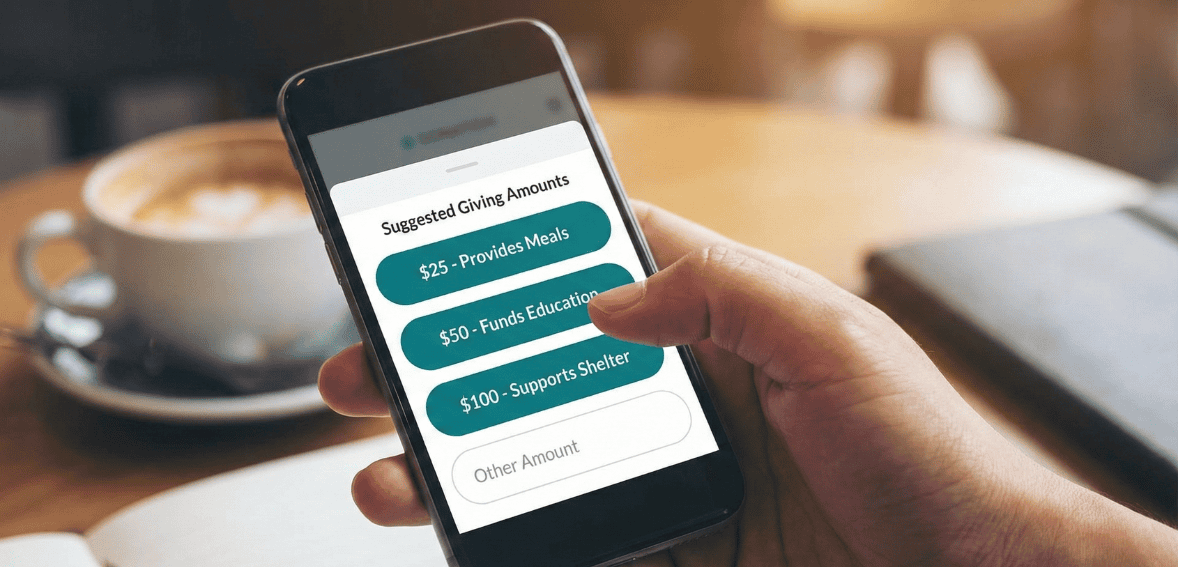
Many donors hesitate when faced with an open-ended question about how much to give. Suggested giving amounts simplify decision-making and often lead to higher average gifts. When donors see a range of options, they are more likely to choose one rather than overthink the decision.
The suggested amounts appear adequate and aligned with donor expectations. For US audiences, standard ranges might reflect typical discretionary giving habits. Pairing amounts with brief impact descriptions can further clarify value, helping donors understand what their gift can accomplish without overwhelming them with detail.
Offering a recurring donation option alongside one-time gifts can also increase long-term support. Many donors are willing to commit to monthly giving if the option is presented clearly and without pressure. Making this choice visible during the initial checkout process integrates it naturally into the online giving experience.
Another consideration is transparency around processing fees. Some nonprofits allow donors to cover transaction costs so the organization receives the complete intended gift. When this option is presented clearly and respectfully, many donors choose to participate. The key is to keep the option simple and avoid making donors feel obligated.
Ensuring a Smooth and Clear Checkout Process
The checkout process should feel intuitive from start to finish. Confusing navigation, unclear buttons, or unexpected steps can cause donors to second-guess their decision. Button labels should clearly describe the action being taken, such as completing a donation, rather than using vague or generic language.
Consistency in tone and design also matters. The donation form should visually align with the rest of your website so donors feel they are still within your organization’s trusted environment. Sudden changes to the layout or branding can raise concerns, especially if the form redirects to a third-party platform.
For organizations using donor management systems, having access to form analytics can provide valuable insights into where donors drop off. Platforms such as Cloud Donor Manager can support nonprofits by offering flexible form customization and visibility into donation behavior, making it easier to identify areas for improvement without disrupting the donor experience.
Measuring Success and Improving Over Time

Donation form optimization is not a one-time task. Donor expectations evolve, and what works today may need adjustment tomorrow. Tracking performance metrics allows nonprofits to make informed decisions rather than relying on assumptions.
Monitoring your conversion rate is a starting point. Comparing the number of visitors who reach the donation page with the number who complete a gift helps assess the form’s effectiveness. Sudden changes in conversion may indicate technical issues or confusing updates that need attention.
Testing small changes can yield meaningful results. Adjusting field order, refining language, or improving mobile usability can each influence donor behavior. Making one change at a time helps isolate what works and what does not. Feedback from donors can also provide valuable qualitative insight into the user experience.
Over time, these incremental improvements add up. A donation form that is regularly reviewed and refined will continue to support higher completion rates and stronger donor relationships.
Adapting Optimization Strategies for Third-Party Donation Forms
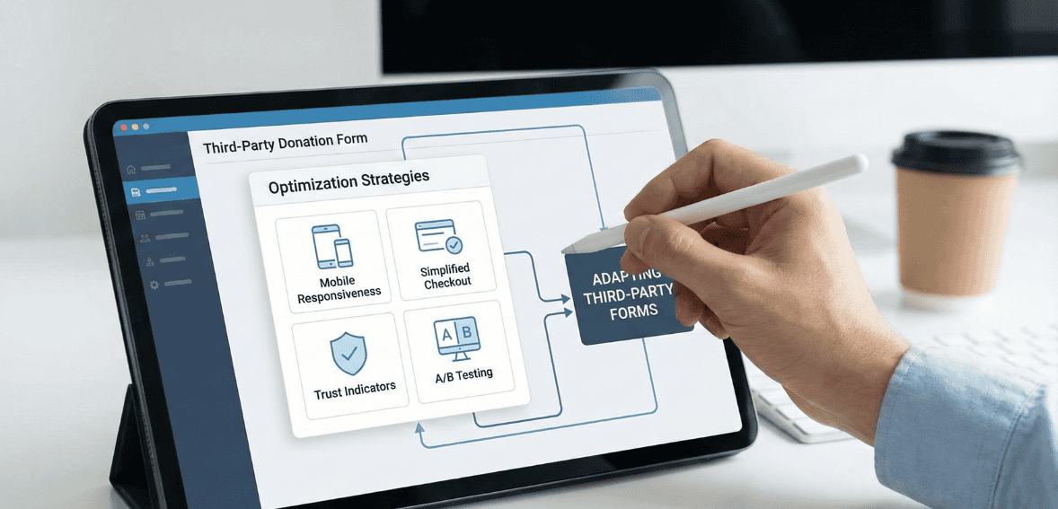
Many US nonprofits rely on third-party donation tools because of limited internal resources. While these platforms may restrict customization, optimization is still possible. Clear messaging before donors reach the external form can set expectations and reduce confusion.
Brand consistency remains essential even when using external tools. Including your organization’s logo, mission statement, or a brief thank-you message can reassure donors that they are giving to the correct nonprofit. Avoid adding unnecessary fields when customization is available, and explain any required steps that might surprise donors.
If analytics show persistent drop-offs that cannot be addressed through available settings, it may be worth evaluating alternative platforms. Choosing a tool that aligns with your organization’s growth goals can improve donor retention and increase online donation completion rates.
Conclusion: Turn Donor Intent Into Action
Every nonprofit works hard to earn donor attention, but attention alone does not fund a mission. The donation form is the moment where goodwill becomes a measurable impact. When that moment is slowed by friction, confusion, or doubt, potential support is quietly and repeatedly lost. Donation form optimization enables nonprofits to recover missed opportunities without increasing marketing spend or outreach volume.
By streamlining form fields, improving mobile usability, reinforcing trust, and guiding donors through a straightforward checkout process, organizations can raise their online donation performance in a way that feels natural and respectful to supporters. These improvements are not about persuading reluctant donors, but about removing obstacles for people who already want to give.
For US nonprofits operating in an increasingly digital fundraising environment, the ability to convert intent into action is a long-term advantage. A well-optimized donation form does more than increase today’s conversion rate. It builds confidence, encourages repeat giving, and reinforces the donor’s belief that supporting your organization is both meaningful and easy. When the giving experience runs smoothly, donors can focus on what matters most: advancing the mission they believe in.
FAQs
What is a reasonable conversion rate for a nonprofit donation page?
Conversion rates vary widely depending on traffic sources and audience intent. Across the nonprofit sector, only a small percentage of general website visitors typically complete a donation. However, visitors who intentionally click a donate button are far more likely to give. The most important benchmark is your own baseline. Improving your current conversion rate, even slightly, can significantly increase total revenue over time.
Can small nonprofits realistically improve online donation performance?
Yes. Many improvements involve simplifying existing processes rather than investing in new technology. Removing unnecessary fields, clarifying language, and improving mobile usability can be done with minimal cost and can have an immediate impact on donor behavior.
Should donors be required to create an account before donating?
Requiring account creation generally reduces conversion rates. Most donors prefer a quick, guest-style checkout. Account creation can be offered after the donation is complete or made optional for those who want a saved profile for future giving.
How do we know if changes to our donation form are working?
Tracking metrics before and after updates is essential. Comparing completion rates over similar time periods can reveal trends. Donor feedback and reduced support inquiries about the donation process can also signal improvement.
How often should a nonprofit review or update its donation form?
Donation forms should be reviewed regularly, not only when issues appear. For US nonprofits, a light review every six months and a deeper evaluation once a year helps keep pace with changes in donor behavior, payment methods, and device use. Additional reviews are critical after major campaigns, website updates, or noticeable drops in conversion rate.